I like interesting maps. This one plots 2010 Census data by ethnicity. One dot per person. Click on the image below to go to the larger map. You can scroll in and out to get detail.
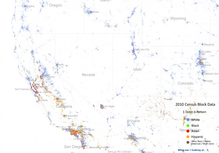 Interesting button on the left. “Remove Color Coding.” Hey look. We’re all the same. Just dots on a map.

Life and all in Redding California